03
Logo
How people recognize Supercube at a glance.
Use the original files from the logo pack and reproduce them exactly, at every size and on every surface.
03.1 · Primary logo
Lockup
The wordmark followed by the S symbol, on one line. The only horizontal lockup and the main Supercube logo.
Use it for
Site header, covers, decks, email signatures and banners: anywhere there's room for a horizontal logo.
03.2
Symbol

The S on its own. Use it when the brand is already clear from context or space is tight.
Use it for
Favicon, app icon, watermark and the corner sign-off on posts and stories.
03.3
Wordmark

"Supercube" on its own, in its italic bold letterforms. The wordmark is a drawing, never retyped in a font.
Use it for
Pieces where the S already appears elsewhere, or lines of text where the symbol would add noise.
03.4 · Square logo
Stacked
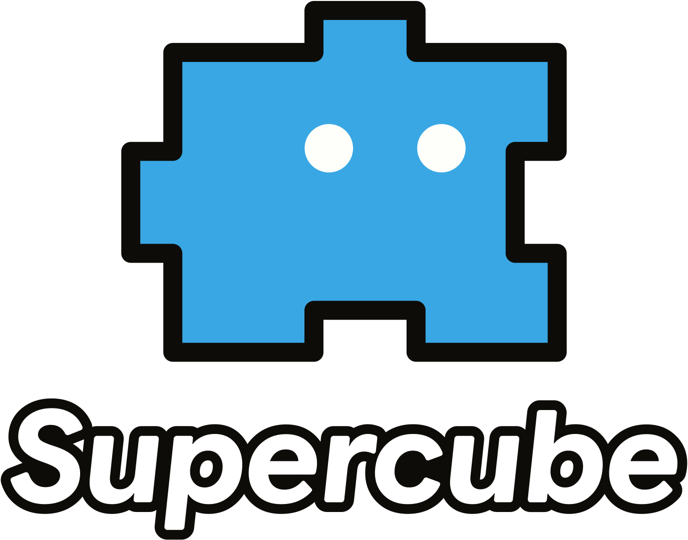
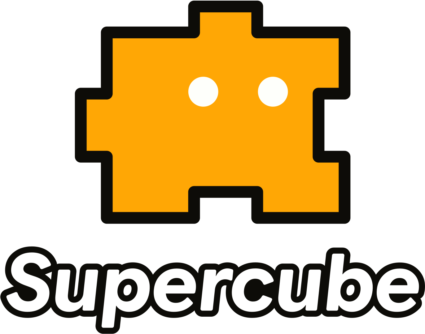
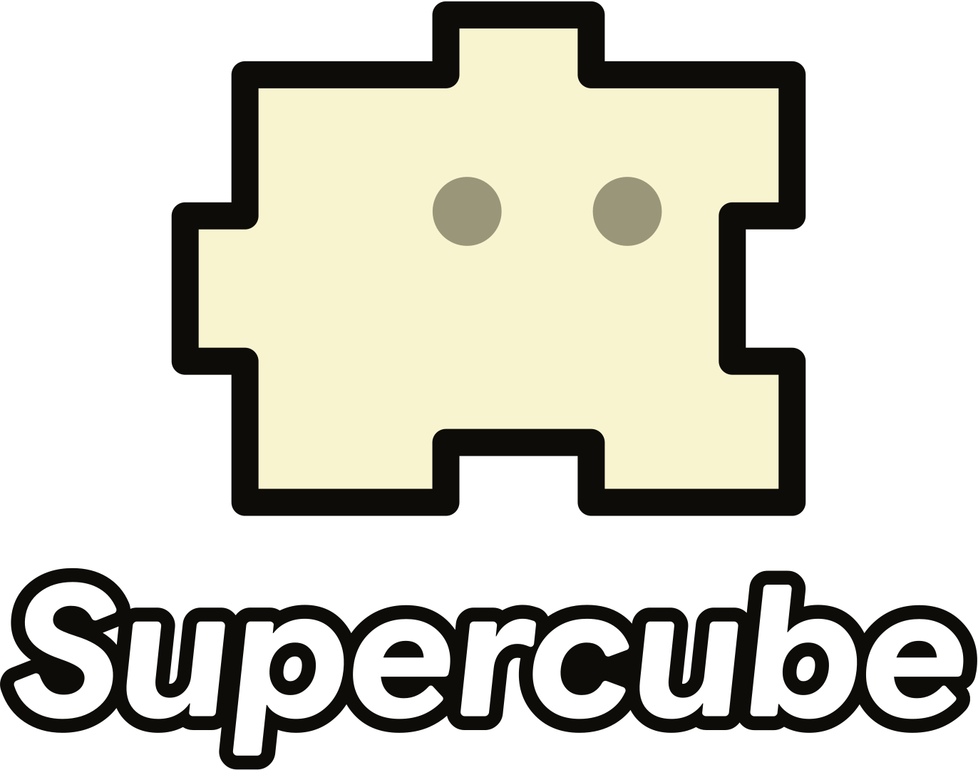




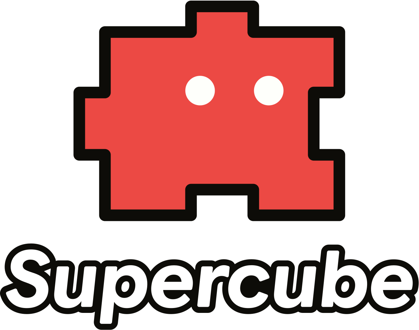
A Cube sitting on top of the wordmark. The Cube comes in Sky Blue, Angry Flamingo, Yellow Sea or Cream; outline and wordmark in Smoky Black on Chalk, or Chalk on color.
Use it for
Social avatars, stickers, merch, square covers and any format where a horizontal logo would look small.
03.5
Clearspace
Every version keeps an empty area around it: no text, graphics or edges of the format inside. Each version has its own unit, X.
 XXXXH
 XXXXH

 XXXXW
03.6
Minimum size
The smallest each version can appear on screen. Samples below are shown at that exact size.
03.7
Logo color
Chalk on color, gradients and photos; Smoky Black on Chalk. Nothing else.



Smoky Black #0D0C08 is the brand's dark color and always replaces pure black #000000.
The Cubes' eyes are Chalk #FEFFFB, except on the Cream Cube.
03.8
What to avoid