
04
Typography
Three Google Fonts families carry the brand.
All three are free under the Open Font License. The four font samples below are live: click one and type your own line.
04.1
Headline
Headlines, titles and key display moments. The slight slant echoes the italic wordmark without competing with it.
Give great ideas character.
Aa Bb Cc Dd Ee Ff Gg Hh Ii Jj Kk Ll Mm Nn Oo Pp Qq Rr Ss Tt Uu Vv Ww Xx Yy Zz 0123456789 &?!
font-family: "Google Sans Flex", sans-serif;
font-weight: 500;
font-variation-settings: "slnt" -2;
04.2
Subheadline
Subheadlines and short supporting lines under a headline. Upright, so the headline keeps the only slant in the hierarchy.
Creative partner for brands on a mission.
Aa Bb Cc Dd Ee Ff Gg Hh Ii Jj Kk Ll Mm Nn Oo Pp Qq Rr Ss Tt Uu Vv Ww Xx Yy Zz 0123456789 &?!
font-family: "Google Sans Flex", sans-serif;
font-weight: 400;
font-variation-settings: "slnt" 0;
04.3
Body
Body copy, paragraphs and longer reading. The serif adds warmth next to the geometric headlines.
Supercube started as a character. As a kid, Joseph drew a cube with superpowers: it could control every other cube around it.
Aa Bb Cc Dd Ee Ff Gg Hh Ii Jj Kk Ll Mm Nn Oo Pp Qq Rr Ss Tt Uu Vv Ww Xx Yy Zz 0123456789 &?!
font-family: "Lora", serif;
font-weight: 400;
04.4
Eyebrow and label
Eyebrows, labels, tags, section numbers, HEX values, file names, dates and keyword lists. Never full sentences.
About this hub · 03.4 Square logo · #39A7E4 · supercube-colors.css
Aa Bb Cc Dd Ee Ff Gg Hh Ii Jj Kk Ll Mm Nn Oo Pp Qq Rr Ss Tt Uu Vv Ww Xx Yy Zz 0123456789 &?!
font-family: "Cascadia Mono", monospace;
font-weight: 350;
04.5
Line height
Larger type gets tighter line height; smaller type gets more room. The blue lines mark each line box.
Give great ideas character.
We help founders who move fast dress their product or service in an identity that shows what makes it unique.
Today we work with founders who move fast. They turn ideas into products quickly and build momentum early. We give what they build a face that shows what makes it unique.
Eyebrows and labels always sit at 120%.
04.6
Size relationship
Every size comes from the headline, H. The headline itself is set by the layout (see 07 Layout).
Web tokens
*Raised to the floor: 40 ÷ 4 would give 10 px body and 40 ÷ 5 would give 8 px labels.
Floors for readability
Body never goes below 16 px on screens or 9 pt in print; eyebrows never below 12 px or 7 pt. When a floor kicks in, raise only the size that is too small and keep the rest.
Going above the calculated size is fine when the hierarchy asks for it: with no body text, an eyebrow can be set at 16 px so it doesn't look lost.
04.7
Hierarchy
The style a text gets depends on its job in the piece, not on its length or position.
One entry point
The headline is the one idea you want read first. If a piece has only one text and it's the message, it's the headline.
8 words at most
A headline never passes 8 words or three lines. Longer lines get rewritten shorter or set as a subheadline.
The logo can lead
When the lockup or wordmark dominates, it takes the headline's place and the line beside it becomes a subheadline.
Headline alone

 2
Give great ideas character.
Subheadline over a photo
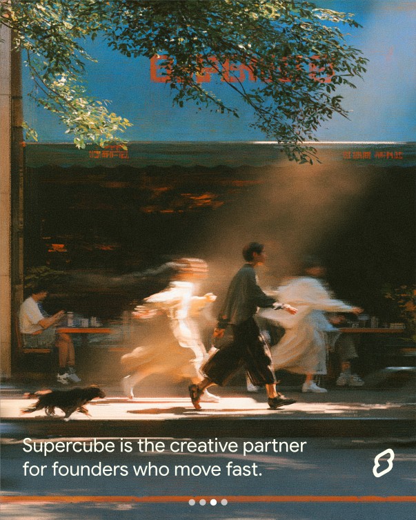 12
04.8
What to avoid
Give great ideas character.
Keep building. We've got the details.
Supercube started as a character. As a kid, Joseph drew a cube with superpowers: it could control every other cube around it.
Give great ideas character.
Supercube started as a character. As a kid, Joseph drew a cube with superpowers: it could control every other cube around it.
Give great ideas character.
Google Sans Flex's other axes (width, optical size, roundness, grade) stay at their defaults.